Convolutional Neural Networks for Traffic Sign Recognition
In this post I describe the work done for the Udacity’s Nanodegree on Self Driving Car Engineer that I am coursing now.
This is a very complete course, and I think it’s a great way of learning. Maybe I’ll write a later post narrating my experience when I complete the Nanodegree. But for now this project is a great exposé of the work I’ve been doing on Convolutional Neural Networks (CNN)
This project creates and train a deep convolutional neural network to classify traffic signs. It uses the German Traffic Sign Dataset. Additionally the model is tested on images of German traffic signs found on the web and from pictures taken in my neighbourhood.
The network is programmed in Python using Google’s TensorFlow framework.
You can check the entire code on my GitHub
Dataset Exploration
1. Dataset Summary
Once loaded, the training, validation, and test data are stored in numpy arrays. Using the shape property of numpy arrays I get the following summary statistics of the traffic signs data set:
- The size of training set is 139196 (34799 x 4)
- The size of the validation set is 4410
- The size of test set is 12630
- The shape of a traffic sign image is (32, 32, 3)
- The number of unique classes/labels in the data set is 43
2. Exploratory Visualization
Here is an exploratory visualization of the data set. On the raw images we observe a variety of illumination conditions, angles, and locations of the sign within the picture. The sign, however, consistently occupy a big area within the picture.
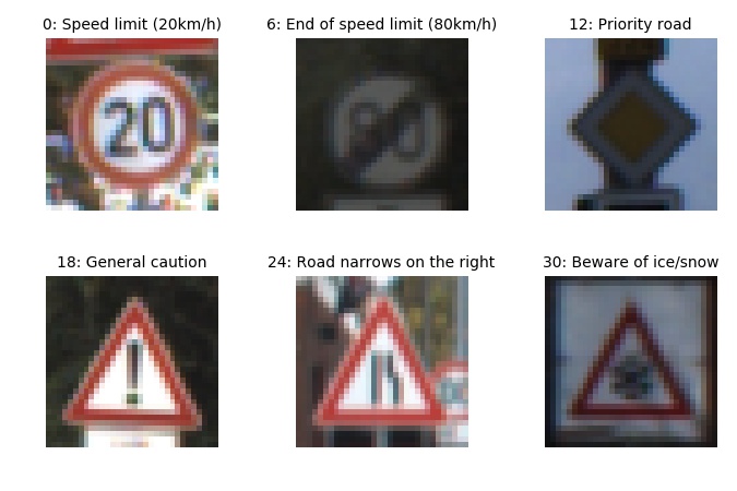
It is interesting to observe how the classes are not homogeneously distributed among the training data. Validation and Testing data present a similar distribution, as shown in the Jupyter Notebook. This can relevant for the accuracy of classes that appear less frequently on the training data.

3. Data augmentation
Data augmentation improves the training of the neural network by artificially adding new data through small transformations of the original data. Our train data was augmented using the routines contained in data_augmentation.py. There are three simple image transformations:
- Translation: the image is moved randomly up to 20% of the image size
- Rotation: the image is rotated randomly up to 25 degrees
- Rectangles: A random black rectangle will cover a portion of the image
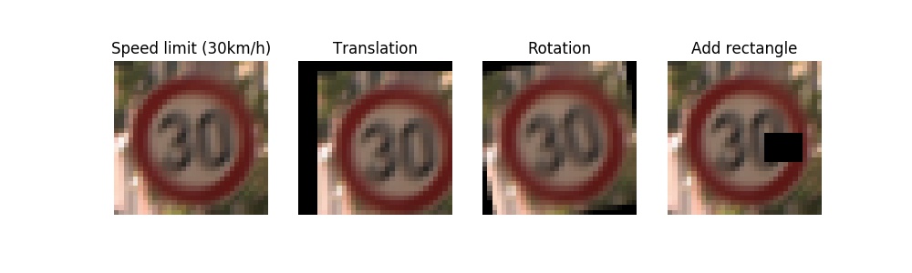
Each of the transformed train sets is saved into its pickle file. This makes possible to add different sets (or all) and explore what effect each of them has on improving accuracy.
Adding these transformed train sets did not improve much the validation accuracy (once the architecture and hyperparameters were optimized). However it improved dramatically the detection of the traffic sign pictures I collected from Internet.
I conclude that training and validation sets had some common properties, maybe coming from the same source, and the model adapted to these common features. Thus it was not doing so good on images with higher variability, randomly collected. That could be corrected introducing higher variability on the training set.
Design and Test a Model Architecture
1. Preprocessing
I decided against converting to greyscale, because a first check did not show an improve accuracy. That makes sense to me, because as humans we rely on the info colour gives us to recognize traffic signs. They are actually designed with simple colour schemes to ease recognition. Thus I would think the colour information is also useful to the neural net.
My preprocessing step is limited to zero centering and normalization.
2. Model Architecture
My final model consisted of the following layers:
| Layer | Description |
|---|---|
| Input | 32x32x3 RGB image |
| Convolution 5x5 | 1x1 stride, valid padding, outputs 28x28x32 |
| RELU | |
| Batch normalization | |
| Max pooling | 2x2 stride, outputs 14x14x32 |
| Convolution 5x5 | 1x1 stride, valid padding, outputs 10x10x64 |
| RELU | |
| Max pooling | 2x2 stride, outputs 5x5x64 |
| Flatten | output dimension: 1600 |
| Fully connected | output dimension: 1024 |
| Fully connected | output dimension: 344 |
| Dropout | keep_prob: 0.5 |
| Fully connected | output dimension: 43 |
3. Model Training
The model training uses Adam optimization algorithm. After 5 epochs the results were already above 93% on the validation set, and variation minimal between the lasts epochs. For the final training I let it run for 10 epochs, achieving 96% accuracy on the validation set.
The highest learning rate I could manually set without leading to loss divergence was around 5e-3. I set then the rate to 1e-3 and applied learning rate decay of 0.9 after each epoch. This resulted in a slight improvement on the final accuracy, and a much less noisy loss evolution on the final epochs could be clearly appreciated.
I found a batch size of 256 provided good training and was still not much time consuming.
4. Solution Approach
The model described above is a modification of the LeNet5 architecture used in the classroom at the end of the CNN lesson. The convolution layers in this architecture are well adapted for image classification (it was developed for digits recognition on the MNIST database) and is thus a good starting point for traffic sign classification.
My first implementation just changed the input dimension to 3 channels and output logits to 43 labels. It did not manage to train at all, although it still worked properly on MNIST. After debbuging I realized that my model would only begin to train after changing the weights declaration from tf.Varible(...) to tf.get_variable(...). I suspect the difference lies in the particular initialization of weights with both variables declaration, being one not fitting for the German Sign Dataset, maybe due to coloured images.
Afterwards the following additions to the model were applied consecutively. Each of them helped to push the final accuracy several basic percentage points upwards:
- Parameter increase on convolution layers (conv1: 6 to 32, conv2: 16 to 64)
- Parameter increase on fully connected layers (fc1: 400 to 1024, fc2: 84 to 344)
- Dropout
- Batch normalization
The bigger parameter numbers for convolutions and fully connected layers lead quickly to overfitting. The training accuracy shot up to 100% while the validation lagged below 90%. The dropout layer significantly reduced the overfitting problem, and was actually only relevant with high number of parameters.
My final model results were:
- training set accuracy of 100%
- validation set accuracy of 96.8%
- test set accuracy of 95.9%

Test a Model on New Images
1. Acquiring New Images
I researched German traffic signs images on the web. I also took some pictures of traffic signs in my neighbourhood which, living in Germany myself, were well fitting for this project.
The pictures I took, as well as some found on the web were classified correctly and, once the model was trained with over 93% accuracy, represented no challenge.
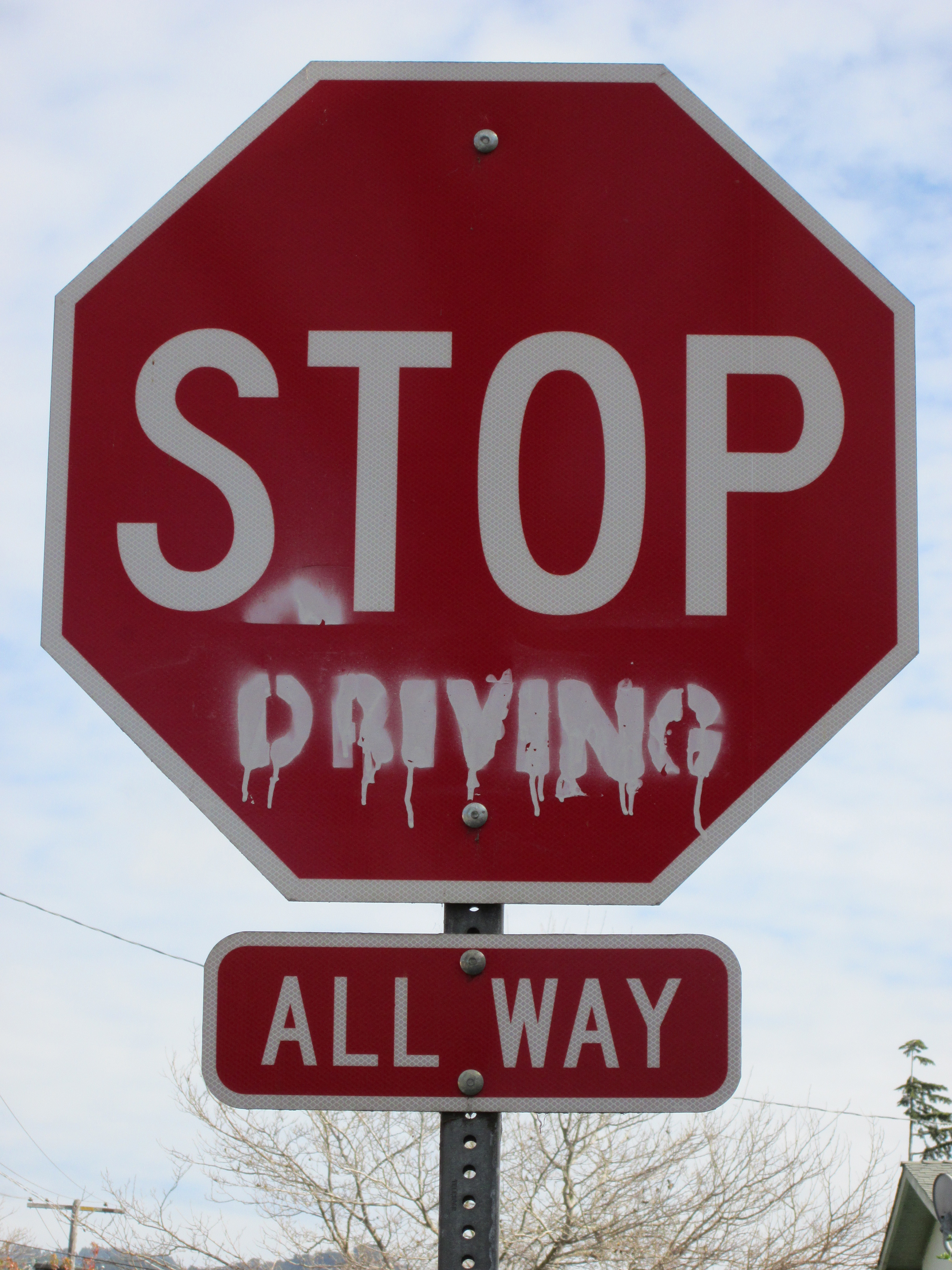
I include more challenging images as they are useful to test the limits of the model, such as:
- A defaced “Stop” sign
- A “Dangerous curve to the left” that is probably not a German sign (German signs on the dataset show a curve with an almost right angle). Also it is relevant to remember that its class is one with the lower frequency in our training data histogram shown above. Thus the issue may be also related to lack of training examples.
- Incorrect cropping. Some signs were inside broader pictures, and I manually cropped the sign. If this cropping is not well focused on the sign, classification is difficult.
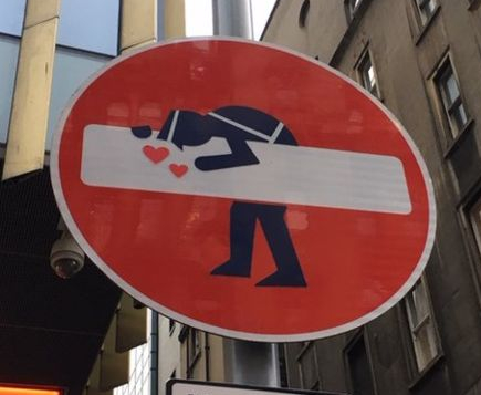
- Edinburgh’s road signs hacked by artist

2. Performance on New Images
Here are the results of the prediction:

As mentioned above, I was very happy to find 100% accuracy in the pictures I took on my neighbourhood and some from the web. However I decided to focus on the more challenging cases for this project. Here the accuracy was 60%.
The main factor for improving this accuracy was the data augmentation process. As mentioned before, data augmentation did not improve the validation accuracy (it was already around 95%). However, without this step, only the”Yield” sign picture I took with my camera was recognized. That difference surprised me, and I decided to explore what effect each of my new datasets had:
| Data augmentation | Accuracy |
|---|---|
| None | 20% |
| Translation | 40% |
| Rotation | 40% |
| Rectangles | 40% |
| Translation + Rotation + Rectangles | 60% |
Which shows each of the transformations contribute to improve the accuracy, and adding the resulting data just adds to the final improvement. Of course, as the transformations were made with randomized parameters, these results could vary on successive runs.
3. Model Certainty - Softmax Probabilities
We can evaluate the softmax probabilities assigned to each class with the function tf.nn.top_k, as explained in the Jupyter Notebook . Looking at the top 5 classes on each picture gives us an insight to how certain the model is of its predictions.
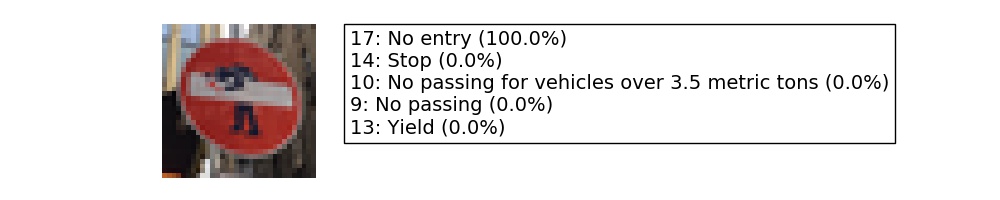


On the first picture, despite the artistic addition, the correct class is given with 100% probability.
The second picture was taken with my camera and, despite what I thought were challenging illumination conditions, it detected the right class with 100% probability.
The third picture is interesting because, although to the human eye it is very easy to recognize, the model fails completely. It shows how sometimes what we consider small variations (a little bigger angle in the central line) can counter-intuitively confuse the model.
The fourth picture is also almost perfectly recognized after the data augmentation.
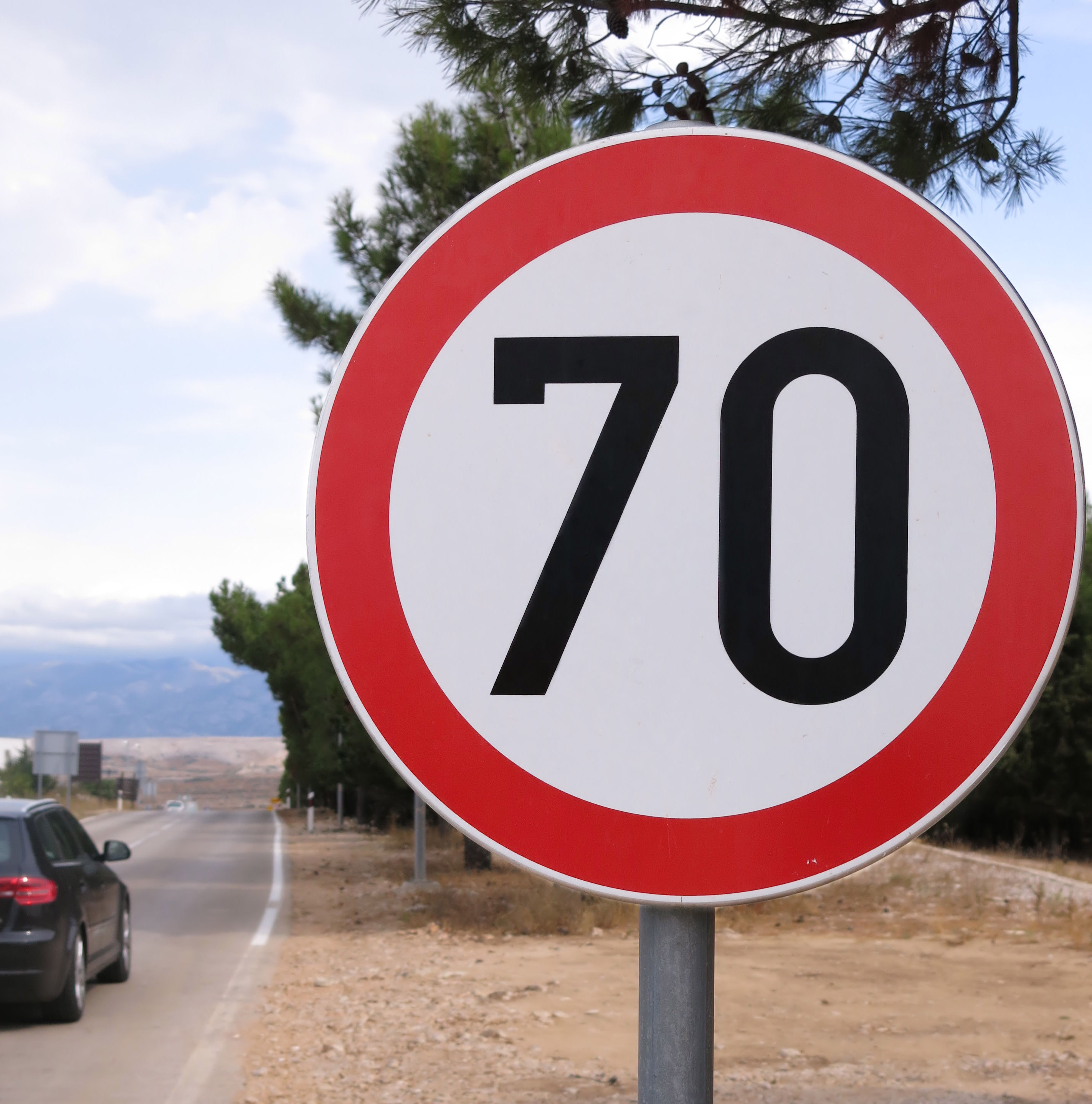
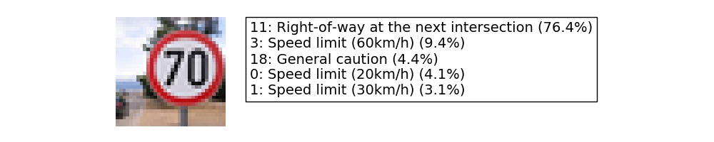
The fifth picture fails to be correctly classified. Interestingly, the model considers similar speed limits signs as second, fourth, and fifth options. In another cropping from the original picture, where the sign was bigger and better centered, the class was recognized by the model. In a real world application my manual cropping would be implemented by a detection algorithm. I decided to show this example to highlight how critical the detection algorithm would be.
4. Further exploration in data augmentation
As I was fascinated by the effect of data augmentation on classifying randomly selected pictures from the web, I decided to implement two other transformations and further augment my training data: Perspective change and adding white coloured rectangles, using again the OpenCV library in the file data_augmentation2.py.
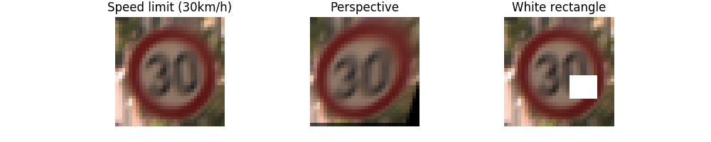
The addition of white rectangles had a disappointing result. Accuracy was actually down, as the stop sign was no longer recognized. I could not make further experiments (different colours?) to check why this was so, because with bigger datasets my training time was getting too long, and even running out of memory in my computer.
The perspective change however was very successful. Accuracy grows to 80% as the “Speed limit (70km/h)” was correctly detected. Unfortunately the dangerous curve to the left is still misclassified. The model is now even totally sure on its wrong prediction. This is especially disappointing as I thought the orientation was the main cause of error in this picture, and this inspired me to implement the perspective change.
The new probabilities are in general much better as shown below:


Visualizing the Neural Network
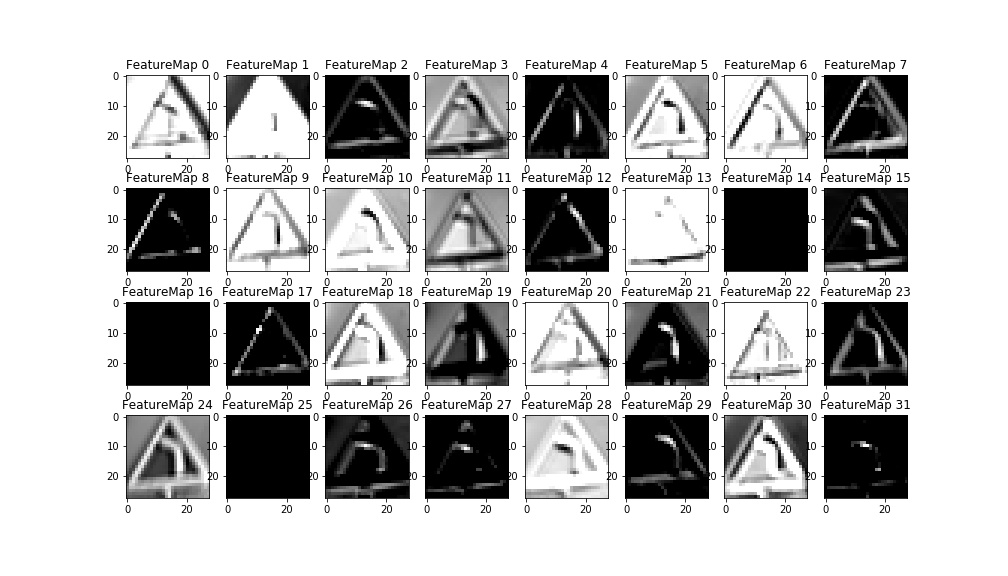
As suggested in the notebook, the convolution layers can be visualized by the piece of code provided. I only needed to pass the convolution layer as output from the model function, in order for the variable to be accessed by the code.
While the second convolution layer losses an easy geometrical interpretation, the first convolution layer visualizations highlight clearly the features of the sign. I chose to plot the only misclassified sign.
The different filters highlight different features of the image, as can be seen below. Some have an easy interpretation. For example, FeatureMap2 highlights the horizontal lines while FeatureMap highlights the vertical lines. FeatureMaps 8 and 12 seem to respond to the diagonal lines that would form the triangle of a warning sign. FeatureMap17 probably activates with the red colour. Unfortunately it is still not fully clear to me, from these maps, why this picture is misclassified as a warning for traffic lights. Some hypotheses can be made, though. For example the combinations of feature maps 26, 27, and 31 may be interpreted as the three colours location of a traffic lights warning sign. A comparison with the feature maps of a real traffic lights warning sign could be very informative to further debugging in this direction.